Visualizing the Loss Landscape of Neural Nets
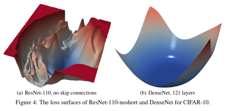
Here are some notes take while reading the NeurlIPS 2018 paper Visualizing the Loss Landscape of Neural Nets. This work helps explain why some models are easier to train/generalize than others. The above image is a good illustration: with a much smoother loss landscape, DenseNet with 121 layers is much easier to train than a ResNet-110 without skip connections, and generalizes better in the mean time.
The traditional way of visualizing loss functions of neural models in 2D contour plots is by choosing a center point $\theta^*$ (normally the converged model parameters), two random direction vectors $\delta$ and $\eta$, then plot the function: $$f(\alpha, \beta) = L(\theta^* + \alpha \delta + \beta \eta)$$ Batch norm parameters are unchanged.
The above method fails to capture the intrinsic geometry of loss surfaces, and cannot be used to compare the geometry of two different minimizers or two different networks. This is because of the scale invariance in network weights (this statement only applies to rectified networks as per the paper). To tackle this, the authors normalize each filter in a direction vector $d$ ($\delta$ or $\eta$) to have the same norm of the corresponding filter in $\theta$: $$d_{i, j} \leftarrow \frac{d_{i, j}}{||d_{i, j}||} ||\theta_{i, j} ||.$$ $i$ is the layer number and $j$ the filter number. With the proposed filter-wise normalized direction vectors, the authors found that the sharpness of local minima correlates well with generalization error, even better than layer-wise normalization (for direction vectors).
Why flat minima: In a recent talk1, Tom Goldstein (the last author) pointed out that flat minima correspond to large margin classifiers, which is more tolerant to domain shifts of data, thus having better generalization ability.
Known influential factors: Small-batch training results in flat minima, while large-batch training results in sharp minima. Increased width prevents chaotic behavior, and skip connections dramatically widen minimizers (see figure in the beginning).
Interpreting with precaution: The loss surface is viewed under a dramatic dimensionality reduction. According to the authors’ analysis, if non-convexity is present in the dimensionality reduced plot, then non-convexity must be present in the full-dimensional surface as well. However, apparent convexity in the low-dimensional surface does not mean the high-dimensional function is truly convex. Rather it means that the positive curvatures are dominant.
In a nutshell: It’s a great work trying to visualize the mystery of what’s going well/bad when training a neural model. Although claiming the study to be empirical, I personally found their experiments and results very convincing. Appendix B about visualizing optimization paths is also very insightful, and the authors probably also thought so, so they decided to move it as a main section in their latest Arxiv version 😄!
Further thoughts/questions:
- Has it been done for visualizing NLP models?
- Is it more appropriate to visualize loss for NLG or other measures? This might depend on how to define “labels” in NLG tasks.
- How big a convolution filter normally is?
- What’s similar between RNN and skip connections?
- This work can be used together with automatic neural architecture search, but is there any other more efficient way of getting better models?
-
Generalization in neural nets: a perspective from science (not math) Starting at 1:54:00 in the video. ↩︎
Shaojie Jiang
Manager AI
My research interests include information retrieval, chatbots and conversational question answering.